review by Jill Julius Matthews
'Modern' is an odd word, curiously ahistorical. Modern is at once now, and then: simultaneously the present moment with a hint of tomorrow, as well as all our yesterdays in their moment of presence, the ephemeral past of endlessly superseded fashion. For scholars, it is a site of contestation between variously identified past moments when, somehow, then became now. (Most art historians opt for the early decades of the twentieth century; some philosophers prefer the late eighteenth.) The variety and complexity of 'the modern' have generated a confusing lexicon of multiple and incompatible meanings for modern, modernisation, modernity, modernité, modernism. In other words, modern is a bugger of a concept to work with, and whoever does so will get into strife.
In 2003, an eminent team of art and architectural historians — Andrew McNamara, Ann Stephen and Philip Goad — began a project to look at the reception of modernism in Australia. Their research has resulted in a very substantial body of work: a thousand-page collection of documents, Modernism & Australia: Documents on Art, Design and Architecture 1917–1967 (Miegunyah Press, 2006), an edited collection of 25 articles, Modern Times: The Untold Story of Modernism in Australia (Miegunyah Press, 2008), and a major exhibition of the same name. Their labours have added enormously to our understanding of the range and significance of creative expression in twentieth-century Australia.
photograph by James Birrell
Powerhouse Museum
The team's approach was ambitious and revisionist. Their starting premise was that, in order to understand 'how modernist visual idioms became ubiquitous in everyday contemporary design and our built environment', it would be necessary to reject an understanding of modernism as 'a phenomenon of "fine art", or simply painting' and, instead, to investigate 'modernism's highly public impact across a range of media (design, photography, advertising, architecture and art)'. Such a move meant cutting across that art history tradition which sees modernism as a formal experimentation in which form is privileged over content and style over subject matter, and which then dismisses it as individualistic formalism, Eurocentric, internationalist imperialism, and/or retrogressive. A further rejection was of Bernard Smith's influential 'time-lag' notion, that modernism in Australia was a late arrival, that it 'arrived in a suitcase' and that 'modernist influences were worked through long after the initial inventive moment had been eclipsed at its source'. The team also rejected the standard chronology that limited modernism to the inter-war period.
Against such traditional understandings, they emphasise three themes: internationalism, abstraction and interdisciplinary practice, and expand the time frame by 30 years, up to 1967. This latter move I consider a mistake. I can find no satisfactory justification in either the books or the exhibition to carry the idea of modernism into the 1960s. The creation of the Australia Council in 1967 is an impossible 'natural endpoint' to a story of modernism in Australia, where the focus is not institutional. A more theoretical justification is needed.

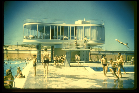
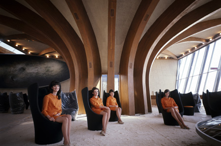
Each room of the exhibition is organised according to a mix of theme, chronology and influence. The 'Teachers exhibition notes' on the Powerhouse website reproduce the introductory panels for each room, but cannot represent the space and design of the actual exhibition, which, unfortunately, fails to suggest let alone dramatise the spirit of the new. There is great stuff on display — paintings, photographs, sketches, costumes, books, artefacts, furniture, models, installations, videos — much of which comes from the Powerhouse's own collection. But I was constantly musing, how does this connect with that? Why are these things together? There is too much time and space in-between. I loved the enormous Marion Mahoney star light from the Melbourne Capital Theatre and the mention in its caption of the lightshow at the theatre before the movie show; and I was intrigued by Hirschfeld-Mack's Colour-Light Play. But what is the connection (more than temporal coincidence) between these two 1920s synaesthetic experiments, and between them and the night architecture of neon signs of the 1960s? Across 40 years, it makes 'modernism' meaningless to imply that the last simply represents the acceptance of the modern into Australian daily life.
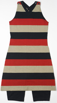
Within the first four rooms of the exhibition certain connections are explicitly and well made. 'Modern bodies' is concentrated in time, from the First World War into the 1930s, and by juxtaposing representations of bodies at war, work, play and performance it illuminates the period's project to create new men and women fit for the modern world. I take it that this is scene-setting, representing the creation of the new audience for whom modernism was the appropriate landscape of life. The second room, 'Metropolitan exchanges', begins a thread that carries through into the fourth, 'Crossing media' room. This relates to the work of the Bauhaus group. The dispersal of that group from its German home in the 1920s has been often told, but the exhibition shows how its ideas and designs were introduced, adopted and adapted in Australia in the 1930s by Hirschfeld-Mack, Fred Ward, Sam Atyeo, and the Burdekin House group, and further elaborated after the Second World War by Clement Meadmore and Studio A. Both of these rooms proclaim a laudable commitment to international multimedia presentation of modernism, but the idea that European modernist practices merely 'inspired' work is far too weak to carry the diversity of exhibits. Also in this half of the show, somewhat tangential but still related to its narrative, is 'Black and white masks', a self-contained and thematically coherent room, addressing the uncomfortable interaction between Aboriginal culture and Australian modernism. For me, Len Lye's 1929 avant-garde animated film, Tusalava, was a revelation. It is always a difficult decision, to integrate or to concentrate Aboriginal material in a broader exhibition. The choice here works well.
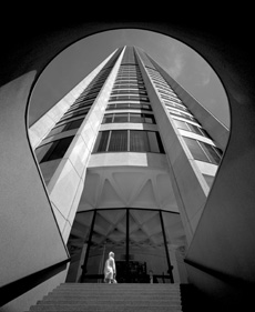
photograph by Max Dupain
courtesy Max Dupain and Associates
This involves a shift of gear to a new meaning of modern. In the first half, the modern is a specific moment in time (the inter-war period); a moment when then became now for a distant and probably foreign people; a time with its own acknowledged aesthetic (modernism), which we today recognise as historic. In the second half, the modern is our modern. The focus is on representing the process whereby our now came into existence from a proximate past. I presume that the curators were attempting to show the lines of connection across the whole twentieth century, between the distant and proximate pasts and now. I don't think it works. To take a simple example: the Gogomobile Dart on display in 'The city' room is presented as a recognisable if nostalgic precursor to our modern cars; but there is no early car, such as a Model T Ford, which was hailed at the time as the true spirit of the modern but would be, in this context, an exotic artefact of the distant past.
The ambition of the whole project would require a blockbuster exhibition to represent and prove its argument. The Powerhouse exhibition is no blockbuster, and it tries to do too much in a small and awkward space. It needs instead to be much more tightly focused and strategic in its selection, and more explicit in drawing out links and influences. This is not a demand for a single narrative thread, rather a plea for evidence of connection.
The website is excellent, containing teachers' notes, a self-guided walking tour, a map of modernism in Australia, and a Flickr group. The publications are provocative and superbly produced. The research team is to be congratulated for reinvigorating the debate around the modern in Australia.
Jill Julius Matthews is professor of history and head of the School of Social Sciences at The Australian National University.
| Institution: | Powerhouse Museum |
| Curatorial team: | Ann Stephen, principal curator with some sections curated by Charles Pickett |
| Design: | Exhibition design, Dian Lorentz; Graphic design, Christina Fedrigo |
| Exhibition space: | approx. 750 square metres |
|
Venue/dates: | Powerhouse Museum, Sydney, 8 August 2008 – 15 February 2009 |
| Publication: | Modern Times: The Untold Story of Modernism in Australia, edited by Ann Stephen, Philip Goad and Andrew McNamara, Powerhouse Publishing, 2008. RRP A$49.95 |
