Design 29: Creating a capital
It is Canberra’s centenary year. The national capital is awash with exhibitions and celebrations, though like other celebrations in each of the states, there is often more hoopla than substance. Having lived in Canberra in a variety of locations, from the now demolished Graduate House, on the corner of Northbourne Avenue and Barry Drive, to the finely laid out streets and walkways of Griffith, I approached an exhibition about ‘creating a capital’ with high expectations.
Let us start with the title. Why is this exhibition called ‘Design 29’? It transpires that ‘29’ is the number allocated to Walter Burley Griffin’s submission to the international design competition, which attracted 137 entries. The title sells the exhibition short, not least as some of the runners up – each fascinating in their own way – are also on display.
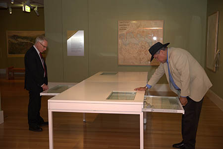
What would a visitor, especially a non-resident of Canberra, expect from such an exhibition? Surely you would want to know why the site was chosen. But you can only figure that out if you search through the white drawers, pulling one out to glimpse the report on the choice of site. Then you can’t read more than a short excerpt. Why not a bold wall caption explaining that the federal capital had to be within New South Wales, but more than 100 miles from Sydney: this to placate both the Victorians and the New South Welsh in the lead-up to Federation, deliberately preventing either Sydney or Melbourne from becoming the national capital. And wouldn’t you also want to know what the design rules were, apart from the obvious, including siting a new Parliament House? Again you have to forage in the drawers; it isn’t explained in the wall captions.

National Archives of Australia
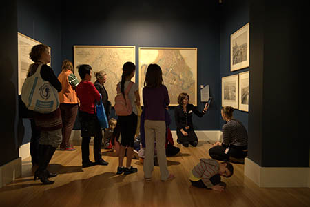
When you see the informative maps and drawings, from the elegant renderings of Marion Mahony Griffin, to the heavy-handed neo-classical musings of the Australian runners-up, Coulter/Griffiths/Caswell, lots of questions occur. Did designers have to include an ornamental lake? Were you not only required to make the railway link to Queanbeyan (and thereby to Sydney and Melbourne) but provide the new city with an entire railway system? And why did some competitors provide tramways and an airport, and others not?

National Archives of Australia
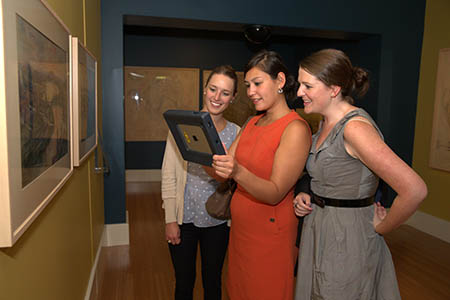
After a preliminary reconnoitre of the magnificent maps and plans – well-conserved and well-displayed – I sought edification from the iPad, available without charge to exhibition patrons, promising, according to the National Archives’ website, ‘augmented reality technology’. Having recently been impressed by the ‘O’ portable screens at Mona in Hobart, with their GIS (geographic information system) placement and curatorial notes, I found the Design 29 iPads clumsy, with an odd mix of useful explanatory text and tourist mug shots of Canberra today. Why bother with a shot of an aerial balloon over Canberra, unless it can somehow be linked back to some of the competitors’ early aspirations for the national capital as a dirigible aviation hub? There is no ability in the program to focus on particular sections of the maps and plans to seek further elucidation. One of the plans includes a steel arch bridge, which visitors, during my viewing, understandably thought might have had something to do with the Sydney Harbour Bridge. But these plans were drawn in 1911, so the relevant context is the Hell Gate steel arch Railroad Bridge in New York, then on the engineers’ drawing boards, with construction beginning the following year. There is very little sense in this exhibition of what is going on in the rest of the world at this time, and what developments, including railways and tramways, might have impinged on the minds of the competitors.

National Archives of Australia
But what fantastic maps and plans. Canberra is our only city planned from scratch, with the crucial advantage of leasehold land, which gave town planners much more control over land use. It draws on other planned capitals around the world, especially Washington, and it takes inspiration from the garden city movement, and the Chicago ‘City Beautiful’ plans. But that is not obvious from visiting this exhibition. What a different city Canberra would be if it had been built around a railway and tramway system, inserted into a landscape formerly dominated by sheep. Instead, our national capital is almost as car-dependent as the Gold Coast. But it does have brilliantly designed, pedestrian-friendly inner suburbs, created between the 1920s and the 1970s, better than any found elsewhere in Australia. The impetus for this admirable urban design can be seen in the plans of a number of the competitors.
All the architects who submitted plans clearly relished the chance to devise a completely new city. There is no doubt that the most elegant plans and cross-sections came from the Griffins, though even they couldn’t resist the occasional neo-classical structure in the new landscape.

National Archives of Australia
The National Archives is to be commended for conserving these original plans and making them available to the public. The Federal Capital Design Competition remains the most important urban landscape intervention ever contemplated in Australia. Unlike our only other notable international design competition, for the Sydney Opera House, these competitors had to create an entire city, not simply a single structure. They thought about both urban form and national monuments. It is our national tragedy that, while we ended up with plenty of national monuments overlooking a newly created lake, the resulting city has not delivered the sense of urban intimacy that most competitors aspired to. You can no longer get any sense of this in Civic, the erstwhile city centre, or in the gargantuan privatised airport, but you can still glimpse it in the civilised and intimate design of Canberra’s older suburbs.
Peter Spearritt, a professor of urban history at the University of Queensland, has lived in Braddon, Curtin, the Harry Seidler townhouses (built for the Australian National University) at Garran, now demolished, and Griffith.
| Exhibition: | Design 29: Creating a Capital |
| Institution: | National Archives of Australia, Canberra |
| Curator: | Jane Macknight |
| Exhibition design: | WHITECUBE Pty Ltd |
| Graphic design: | Lora Miloloza |
| Floor area: | 250 square metres |
| Venue/dates: |
National Archives of Australia, Canberra 1 March – 8 September 2013 |
| Exhibition website: | Design 29: Creating a Capital |
| Exhibition blog: | http://blog.naa.gov.au/preservation/ |
