This is an edited transcript of interviews held on 19 April and 25 May 2007.
Andrew Andersons AO was a young architect in the State Government Architect's Branch in Sydney when he designed the first modern extension to Sydney's Art Gallery of New South Wales — the Captain Cook wing — in the late 1960s. He went on to be the architect of a number of alterations to the art gallery during subsequent decades.
Having been the architect of earlier changes and additions to the National Gallery of Australia in Canberra, Andersons currently has a commission for further design improvements and extensions to the National Gallery that are now under construction. His other commissions have included the conversion of a seven-storey state government office building into Sydney's Museum of Contemporary Art (MCA); a major extension to the Art Gallery of South Australia in Adelaide; extensions to the Ballarat Fine Art Gallery and to the Museum of Modern Art at Heide (both in Victoria); the Queen Victoria Museum and Gallery in Launceston, Tasmania; the Penrith Regional Gallery, New South Wales; and the Queensland University of Technology Art Museum, Brisbane.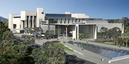
architect: Andrew Andersons, PTW Architects
____________________________________________________
Leon Paroissien: I would like to talk about issues relating to museum design in Australia in recent decades. However, I would like to begin by asking you to talk a little about the way you first became interested in museum design issues, and the remarkably early opportunities in your career that allowed you to put your ideas into practice.
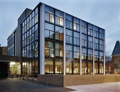
architect: Louis Kahn
© 2009 Yale University Art Gallery
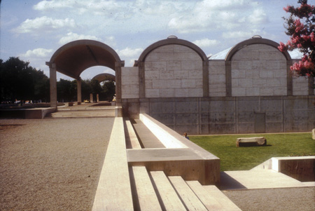
Andrew Andersons: I was a trainee of the Public Works Department in the office of the Government Architect and in those days the Government Architect's Office did all the public buildings in New South Wales. Peter Webber, who was then in the Government Architect's Office and later became a professor, had done a scheme to add to the Art Gallery of New South Wales. It must have been 1964 or 1965. I actually did some drawings for this work under his instruction. I think gallery director Hal Missingham had already written the outline of a brief for the building. In 1965 I went to Yale University to do a Master of Architecture degree and that was very exciting for me, not only in terms of architectural education, but also because Yale University had an excellent art museum. It was Louis Kahn's first building, and a very significant building. It was an inspiration for me in the work I did later for the Art Gallery of New South Wales. That building has influenced other architects — including Col Madigan in his work on the National Gallery building in Canberra. Through living in New Haven in close proximity to New York I was able to visit frequently places like the Museum of Modern Art, the Metropolitan Museum, the Jewish Museum, and also the recently completed Whitney Museum by Marcel Breuer. So it was a very fast learning curve to come from Sydney to a location full of outstanding museums — outstanding collections, but also in some instances outstanding buildings. I also had the good fortune to do a history of art and architecture course under the great populist lecturer Vincent J Scully. This was one of Yale College's most popular courses, with classes of 500. Vincent Scully did quadruple projection illustrating art and architecture, and anyone doing a course like that ends up with a lifetime love of the visual arts.
LP: When the Captain Cook wing of the Art Gallery of New South Wales opened in 1972, people responded enthusiastically to the clarity of layout, to spaces that made viewers comfortable, and especially to the breaking out of the tradition of an enclosed box to open up a vista towards the harbour. Would you tell me a little of your thinking, and of museum models that had interested you at the time?
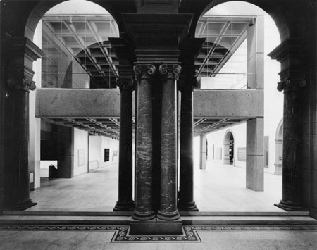
architect: Andrew Andersons, Public Works Department, New South Wales
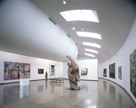
At the same time the junction of the old and new buildings was celebrated by a kind of top-lit gallery with windows to the west and windows to the harbour — to the north. What was now a much larger building had a kind of transparency and permeability. You could see the wonderful harbour setting from inside the building. It opened to considerable acclaim because the building was completely transformed.
If I think back and wonder how a young architect of about 25 years of age suddenly had this extraordinary responsibility thrust on his shoulders, the ability to deliver was partly because of a kind of young arrogance that I had been exposed to all the best things in the world in architectural terms in America and in Europe, but also because I was part of an organisation that had considerable power to put things into effect, and I had the support of Peter Webber and the late Harry Rembert, who was the Assistant Government Architect at the time. Rembert was a very distinguished, under-recognised architect who had travelled to Finland in the 1930s. He was a very fine architect. They had trust in me. They of course looked at what I had produced. It had to be approved, but no one particularly influenced me in my work. It all happened because it was a rather authoritarian regime, but usually acted in a very responsible way.
Although the extension opened as long ago as 1972 and has never been refurbished it seems to work perfectly well and suited to today's needs 35 years after the opening.
LP: Around the time you were working on the first modern extension to the Art Gallery of New South Wales an extension to the Art Gallery of South Australia had been completed, the new National Gallery of Victoria building had opened, and the Queensland Art Gallery building opened subsequently. What were your impressions of these buildings?
AA: The 1960s [North Wing — opened 1962] addition to the Art Gallery of South Australia is quite an interesting building. It's a sort of brutalist concrete building that is now incorporated into the more recent additions I did in the 1990s. The 1960s building had galleries that were quite contemporary in their aspirations — with quite big spans and uniformly illuminated ceilings. The aesthetic intentions were not so different from, say, the Twombly Gallery in Houston with its illuminated ceiling. But I don't think that people had the skill to carry out their aspirations. Today people do wonderful backlit ceilings, often day-lit with beautiful diffusers. This particular ceiling seemed rather glary and there was a grey vinyl floor. This kind of minimalism has to be extremely beautifully detailed and needs very noble materials to come off. I felt the building wasn't very satisfactory, but I think it had some very good ideas.
The National Gallery of Victoria opened in 1968 when the Art Gallery of New South Wales Captain Cook wing was still in late design stage. I had a couple of visits to Melbourne with staff from the Art Gallery of New South Wales, initially to see a prototype of a piece of the façade and a bay of the interior, including the roof lighting washing the walls. At the time I was a little disappointed by the building. I thought it was very traditional typologically. Having three courtyards in a very large rectangular building struck me as being rather old-fashioned. I am far more admiring of the building today than I was at the time because now I can see that, in a very large museum that had to display a diversity of collections, aesthetics and formats, a traditional museum armature was probably much more responsive than the sort of work I was doing at the Art Gallery of New South Wales. One of the things I didn't like about the National Gallery of Victoria was that it was essentially windowless. It was totally internally focused. The three original courtyards have been progressively in-filled. When the building still had its courtyards it was a far more attractive building. But I didn't like the fact that you were totally enclosed by walls and I always thought seeing out of a building made the traverse by the public a far more comfortable experience. I think being in a great museum it's still great occasionally to see where you are and to see the changing pattern of light and shade outside. That seemed to be missing in the building.
When the Captain Cook wing was under construction — it must have been about 1970 or 1971 — I had the pleasure of showing Robin Gibson [architect of the Queensland Art Gallery] around the construction site and ever since that time I have maintained regular contact and friendship with Robin Gibson, who went on to design a whole range of buildings on [Brisbane's] South Bank, not only the Queensland Art Gallery, but the Queensland Museum and a very successful performing arts centre and library. I was very pleased some years later to go to Brisbane and see his building which opened I think shortly after the National Gallery in Canberra. Although it's a building of the same time, it's very, very different in character. It's a much lighter, a very luminous building. Although the works of art themselves are artificially lit, the building seems to be very day-lit because it has this central organisational spine with a water feature underneath. It has a beautiful concrete structure with light reflecting through a series of blades — not unlike what Renzo Piano did many years later in the Menil Gallery in Houston, bouncing light into space that orientates the public beautifully in the building. It connects very nicely with an outdoor courtyard and restaurant. It always struck me as a building that's a delight to be in and has spaces that are nicely scaled in relation to works of art. There's a range of ceiling heights and I imagine it is a fairly easy building to work with.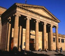
What I didn't like about the building is that it has no obvious entrance. The Buchanan Report [Sir Colin Buchanan, Traffic in Towns, 1963] — a very influential English town planning study — promoted the idea that the public should be on a separate level from motorcars. The centre of Hong Kong is entirely like that. No one is ever at street level. You are at first-floor level on an overbridge. I think tremendous damage was done to cities all over the world in responding to the idea that somehow better cities emerge from separating people and motorcars. Buildings designed under that influence include the National Gallery in Canberra, of course. That building [the National Gallery] was meant to be accessed from the elevated National Place — a plaza 5 metres above street level. One of the great events in going to a great public institution is usually the sense of arrival. If you go to the Metropolitan Museum on Fifth Avenue in New York, it's got the most wonderful portico, staircase, fountains and footpath life. I don't think I have ever been there when there haven't been hundreds of people sitting on the steps in the afternoon sun watching the goings on. It's just a wonderful thing to be at the front door of a great museum and watch that sort of street theatre, the coming and going of people and the vibrancy and uncontrived pleasure of that kind of atmosphere. In a miniscule way, the Art Gallery of New South Wales portico is a very, very pleasant place to sit on the steps, to sit in the afternoon sun, watch people come and go. It's a relatively modest classical portico but in the end it works very well and one of the great faults of buildings like Robin Gibson's building [Queensland Art Gallery] is there's no obvious sense of arrival. You come across the footbridge or you drive into the car park and you catch the lift up. That's an aspect of modernism that's been rethought and most people now see that there's value in a major cultural institution having a real address point, you can see where you arrive and the act of arrival is actually celebrated. If you have a splendid arrival that's inviting, comfortable and joyous, I think your whole experience is far more likely to embody those qualities.
LP: A fundamental question with the most far-reaching consequences for museum building developments is: 'Who is the client?' In Australia most museums are built at the behest of one level of government or another — rather than a museum board or philanthropic initiative as is often the case in the United States. Sadly, in many cases in Australia it is unlikely that the client will be the museum itself. It may be a government department, such as public works; a cultural or arts ministry; or a treasury. Would you talk a little about this issue and about the process you feel ensures the most positive outcomes for the museum and its audiences?
AA: It's very hard to be an architect and not have a client. Architecture in many ways is as good as the architect's client. I have been extremely fortunate with my clients. For the Art Gallery of New South Wales the client was perhaps no one individual. Director Hal Missingham initiated the project. He had written a rather foresighted brief based on an international study tour he had made some years earlier. In the event Hal, who was planning his retirement, didn't particularly participate in the design process. That was handled by Tony Tuckson, the then deputy director, and later on by Daniel Thomas who I think was called curator at the time. The gallery had a very small professional staff. Tony Tuckson was a tough taskmaster: quite demanding and difficult sometimes, but also very, very knowledgeable and very strong in his views. In fact when I started dealing with Tony I didn't realise he was a painter. I had no idea that he was actually one of Australia's finest abstract expressionists. But he had certainly very strong views about display techniques, about flexibility, and about museology. He became heavily involved in all aspects of curatorship and conservation. A lot of concern was paid to all important museum issues. Later on in the process Daniel Thomas became very much involved. He opened my eyes to the ideas of appropriate context for period works — the idea of rehanging the old part of the building with multiple hanging and the idea of using original colours on walls as being appropriate for the works of art. I think the results of all those inputs made the Art Gallery of New South Wales, when it reopened in 1972, a pretty interesting place in terms of Australian art museums.
Now that I have been in private practice for 19 years and I act as a consultant, my relationship is actually quite different in many ways to when I was an officer of the Public Works Department because in a sense the Art Gallery of New South Wales were the users but really the Government Architect was the client. The decision-making power, the responsibility for the project, the responsibility for the finances — the ultimate decision — was in the hands of the Government Architect. That's a rather unusual relationship. I don't think that relationship exists any more anywhere. Government agencies of that sort have been eliminated, usually for good reason. Although in intelligent hands, ethically administered, that kind of relationship can be very good because it also means that there is continuity about the quality of public buildings. One tends to make responsible decisions. One is responsible not only for the construction of new work but also for the maintenance of old work and in a sense there is a kind of trusteeship that is enacted through that process which I actually think has considerable merit although it is very much out of fashion in terms of modern management theory and contemporary ideas about government.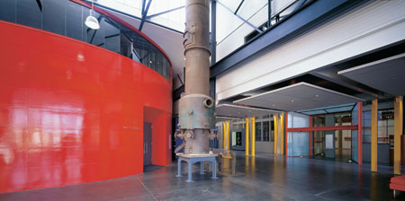
architects: Andrew Andersons, PTW Architects, and Artas
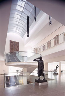
architect: Andrew Andersons, PTW Architects
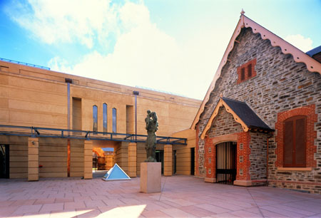
architect: Andrew Andersons, PTW Architects
LP: The compilation of a comprehensive design brief, embracing the history and nature of the site and the community, as well as detailed documentation of what is desired in relation to every facet of a museum in its new building or extension, is essential for a good outcome. What are your thoughts on this, and perhaps you would be prepared to give some examples and talk about the role an architect can play in this important process?
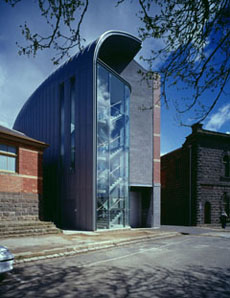
architect: Andrew Andersons, PTW Architects, in conjunction with Peddle Thorp Melbourne
architect: Andrew Andersons, PTW Architects, in conjunction with Peddle Thorp Melbourne
LP: Museums are such complex organisms, incorporating so many specialisations, that a winning design selected in a competition cannot possibly address the detailed character of a museum, its history, its collections, its programs, or all the needs of its diverse operations and publics. Even the best brief in the world, and the selection of a most experienced and gifted museum designer, cannot possibly accommodate every facet of a museum's needs within the restrictions of a design competition. What are your thoughts on a desirable selection process, and on subsequent design and construction approaches likely to ensure the most positive results?
AA: I think that a competition is a mechanism to select the architect and I don't think one should be stuck with a competition design because even with the best brief in the world and a competition that allows for a considerable period of in-depth investigation, it's simply impossible to come up with the best solution. The best solution emerges from detailed engagement with a site, with a professional staff, and with a culture of a place. But a competition certainly is extremely valuable as a part of a hothouse environment. Great ideas emerge that may not otherwise emerge. Certain tasks are better suited to competitions than other tasks. Working in a complex situation with an existing museum and an historical context it's often better to have a process based on capability, track record and interviews, whereas on a 'green-field' site where a client wants to make an iconic statement that perhaps requires architecture to claim a reputation for itself, then perhaps a competition is a good way of doing it. The Taniguchi design for the Museum of Modern Art [in New York], which was in fact achieved through competition, is interesting in that the winning design was in a sense the least assertive outcome. It was the most understated. I think that was particularly right for a very sensitive setting which involved the incorporation of two historic buildings in the overall museum complex. In other cases, such as [the Guggenheim Museum in] Bilbao, for instance, you would have to say Frank Gehry's sculptural vision for the museum has put the city on the map.
LP: Over recent decades new stand-alone state or national museum buildings have been achieved in Perth (Art Gallery of Western Australia 1979), Brisbane (Queensland Art Gallery 1982, Queensland Gallery of Modern Art 2006), Darwin (Northern Territory Museum and Art Gallery 1981 and a 1992 extension), Melbourne (Melbourne Museum 2000), and in Canberra (National Gallery 1982, National Museum 2001). You yourself have never been commissioned to design a completely new freestanding building. Improving a museum in stages — as funding becomes available — seems to be an alternative Australian model. Would you like to comment on this?
architect: Louis Kahn
LP: It seems to me that there is a fundamental difference between the needs of different disciplines in the design of museum exhibition spaces. While non-art museums in recent decades have had specially designed interiors that eclipse the architecture for major exhibitions — for example, in presenting archaeological exhibitions — art museums tend not to prioritise dramatic installation design, preferring to work with the framing interior architecture in exhibition planning and installation, with the emphasis on the power of artworks themselves to establish an impact on audiences.
Meanwhile natural history museums, whose programs are oriented towards the exhibition of specimens or artefacts, place great reliance on commissioning of outside designers and tend to approach each new installation as a fully designed presentation of contents. The darkened exhibition space — especially for the presentation of ethnographic material — has another history. What are your thoughts on the interaction between different exhibition design practices and the interior architecture of a museum?
AA: In all honesty I have actually had little experience in designing non-art museums. I think the natural history or the science museum has a totally different task. Often in natural history museums one is really creating a kind of studio-like box in which anything can happen, whereas art museums and decorative arts museums are all about a kind of relationship between the object on display and the architecture that it is set in. Especially natural history museums these days seem to adopt a kind of attitude that you are recreating some kind of illusionistic setting — be it through projections or elaborate settings — and the architecture seems to vanish completely. So it's a totally different kind of architectural task and architectural aesthetic. Things like arrival, orientation, legibility, imagery, and semiotics of the building are still in a sense the same tasks, but what actually goes on in the museum engages with the viewers in a totally different way. So I think there is a fundamental difference between art museums and other forms of museums. Of course, there are history museums where the historic artefacts are appropriately displayed the way objects of art may be because they may also have great artistic merit. But in other cases, especially in science and natural history, it's a totally different task. I mean the object in fact isn't as important as the kind of impact of the display as a whole. Nonetheless I would have to say that in designing a museum space I constantly think about how it will be lit, how will the object be displayed, is the scale right, how do you arrive in the room, and so on. And one of the problems is finding the right balance between the impact of the architecture and the impact of the object. I can remember visiting the National Gallery building upon practical completion before there were any objects on display in the interiors and thinking, well, this building is attractive and complete without any objects on display. The architecture is so rich it actually didn't need any objects on display. And the Liebeskind Jewish Museum [in Berlin] is a building that had the same quality. Simply as a series of forms and spaces, without anything on display, it was immensely satisfying. In the case of the Liebeskind building, now that it has got a display of Jewish history in Germany, the impact's curiously diminished because whereas there are some very interesting objects, the building no longer has this extraordinary impact that it had as an empty shell. And in some ways this is one of the difficulties of the National Gallery in Canberra. In some instances objects look well but in others they don't look well in this very strong and richly modelled architecture. [The National Gallery], I might say, is currently being relit by George Sexton who is a wonderful lighting designer who has worked on the Louvre and the Museum of Modern Art [in New York]. Skilled lighting can fix almost anything. It can focus the eye; it can change the scale; it can transform the architecture. Lighting is everything in museums.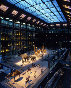
© Muséum National d'Histoire Naturelle
The Natural History Museum in Paris is a wonderful museum. It is a totally audacious refurbishment. I think it's absolutely wonderful. If there's one natural history museum that truly excites it's that museum in Paris near the Jardin des Plantes and it shows you that natural history can have all the visual impact of a great art museum. The French are so audacious and so confident about their culture. The building is a huge Victorian museum that has had very dramatic intervention. The piano nobile has been ripped out; the floor has been replaced by a glass floor. Above the glass floor is a sort of procession of stuffed animals as if going into Noah's Ark in pairs. Below the glass floor is marine life and you can walk among the animals through a whole range of interactive devices from video screens and computer keyboards and information systems of every level of interest through a setting of fantastic impact. It's one of the most exciting museums I have ever been to. It was done with supreme confidence. The building was shut for many years for an intervention that in Australia is impossible because heritage conservation plans would never allow you to do this sort of thing. I guess in France there are so many historic buildings that people can take a more confident attitude towards this. But the outcome is stunning.
LP: During the decades you have been working on museum design how have the changes in museum practices and priorities impacted on building design?
architect: Andrew Andersons, PTW Architects
