

The Australian pavilion at the 1939 New York World's Fair promoted a new independent image of the nation within the Pacific Rim. The article traces the design, publicity and reception of the pavilion within the wider context of the fair's futurism and the looming crisis of the Second World War.
____________________________________________________
Good evening, America. Good evening, from the Commonwealth of Australia, from your friends and neighbours across the Pacific. Today is Australia Day at the New York World's Fair. No doubt many of you have been to the fair and amongst the great national exhibits you have managed to find the Australian pavilion. Our exhibit is far more than a commercial exhibit. It is in fact intended as a graphic message of goodwill from one English speaking country to another ...
(Prime Minister Robert Gordon Menzies, 1939)
Prime Minister Menzies spoke on the new Trans-Pacific Radiophone as if it were a fireside chat at the Melbourne Club. Those listening across the United States, who had tuned in to radio station WJV New York, may have been surprised to hear an unknown foreign leader speaking in such avuncular terms of an alliance with America.
Whenever we meet there is an instinctive bond between us. We are both strongly democratic. We both hate formalities and distrust pomposity. We both put a high premium on the character and powers of the individual. We both have a fresh and optimistic attitude, an outlook on life and its possibilities. In short, we speak to each other in language and with ideas that the other fellow can at once understand. If I may say so, we are bound to be friends. This does not mean that there is any loosening of our ties with our mother country, Great Britain. We the British people of Australia can never fail to appreciate that there is a special link between ourselves and America.[1]
Menzies' claims would shortly be tested by war. For those visiting the fair's vast fantasy landscape laid out on the reclaimed land of Flushing Meadows at Queens, the undercurrents of international politics were visible in the national pavilions that fanned out around a vast pond called the Lagoon of Nations. As a minor player, Australia shared a building with New Zealand below the British pavilion which was overshadowed by Mussolini's majestic porch housing a massive Roman goddess and a waterfall.
Among the millions who flocked to marvel at the fair over the northern summer of 1939 was the director of Sydney's Technology Museum, who made four visits in late July. Like Menzies, AR Penfold was a conservative committed to a technological vision of modernity. At the end of a nine-month museum study tour funded by the Carnegie Corporation, he was exhausted but confessed that 'for the modern museum director' such fairs were 'of more benefit than all the museums in Europe because practically every phase of modern life was covered, including design, architectural form, sculpture, murals, illumination, display technology, horticulture, etc'.[2] Amongst the other Australians who had the opportunity to study the fair were several young architects and designers responsible for the construction of the Australian pavilion. As a well-resourced but ephemeral project it had allowed them to experiment with a range of modern resources and techniques. The pavilion was never seen in Australia but was well known through extensive media coverage; indeed, the glamour and excitement of the New York World's Fair proved a welcome distraction from the anxieties generated by the looming crisis enveloping Europe. The following reading of the pavilion, based on its publicity and several first-hand accounts, proposes that its vernacular modernism promoted a new independent image of Australia as a place of travel, tourism and investment within the Pacific rim.
By the 1930s modern design was beginning to assume a popular character in much commercial and architectural work, though modernism in art remained a contentious, even political, subject. Director Penfold's diary entries reveal his very mixed emotions about the modern when confronting its myriad forms in New York. Up until his arrival in Manhattan the high point of his trip had been the industrial works and museums of the Third Reich which, like many technocrats of the time, he admired. In contrast he found New York chaotic. The Museum of Modern Art (MoMA) did impress him with its 'very fine new building ... of extreme modern design, largely glass', though he could not cope with abstract art, becoming 'very disgusted with the displays because I am not an admirer of extreme modern pictures'.[3] He was impressed by MoMA's display methods and services, particularly the fluorescent lighting, airconditioning, lecture hall, film library and theatrette. As a chemist, Penfold was transfixed by Du Pont's pavilion at the fair, which harnessed the latest publicity methods for didactic entertainment. Its 'Wonder World of Chemistry', designed by the American master of streamlining, Walter Dorwin Teague, demonstrated such modern miracles as liquid acetate turning into silk stockings.[4] In the Government Precinct he was less enthusiastic, examining 'critically the Australian pavilion', noting 'not many exhibits but well planned' and grudgingly admitting that 'the wool looked better than anticipated (staff however wasted). Picture show section admirable ... Opals another exhibit [that] should revolve', ending despondently, 'Nothing restful in NY - everything moves'.[5] The historic pageantry of the British Pavilion, which included displays of the Magna Carta, the Crown Jewels and heraldry, he thought magnificent. His official report on the trip made no reference to the Australian pavilion, possibly because he had felt excluded from its conception.
In Penfold's lifetime the role of organising participation in international exhibitions had sidestepped museums and (in the absence of any national museum) was administered directly by the Commonwealth Government. The grand old days, when Sydney and Melbourne had briefly commanded attention as spectacular sites for international colonial exhibitions, were over. Nationhood had coincided with a loss of economic power for these cities, which could no longer claim the status of being among the 20 largest in the world. Through the early decades of the twentieth century Australia's involvement in various international exhibitions reveals a failure to conceive ways to project the nation beyond its former colonial status. By 1937 a tentative modernity was adopted when the Australian architectural firm then known as Stephenson, Meldrum & Turner was commissioned by the Commonwealth to design a pavilion for the Paris Exposition. It took the form of a diminutive cylinder on a black and orange base distinguished by an 'Australia' sign in orange neon lettering. The interior housed a trade display and travel bureau with large photographs of an Aboriginal head, bathing beauties and a modern house hung around its interior in a continuous 'pictorial girdle'.[6] The art publisher Sydney Ure Smith, who was on the advisory committee, selected a dozen paintings, predominantly landscapes, the most renowned being Arthur Streeton's Land of the Golden Fleece, painted ten years earlier. While affirming pastoral values, the trade commissioners may have felt uneasy when Streeton added several stark tree stumps to the foreground before it was exhibited, reflecting his growing concern with deforestation. The commercial designer Douglas Annand made a stylised ceiling map of the world orientated to the antipodes. Amongst the expatriates who visited the exposition were several young designers then working in London: Gordon Andrews, Raymond McGrath, and Geoffrey and Dahl Collings. Andrews reported that they had been appalled at the display, writing that '[i]t was without a doubt the worst exhibit of all ... arranged on shelves around the perimeter of the interior were pyramids of jams and canned fruit, here and there punctuated by moth-eaten stuffed koalas and wallabies'.[7] While architectural opinion was divided on the pavilion, international politics ensured that it was completely marginalised by the bombastic nationalism that turned the Paris Exposition into a propaganda battle. The showdown between contending ideologies was dramatised by the siting of Albert Speer's German pavilion opposite the Soviet Union's monumental structure topped by a heroic pair of Soviet youths. The Spanish Republican government, desperate for international support, chose a pavilion that represented a modernist alliance against fascism. The exterior incorporated large photomontages on architectural panels, with Picasso's Guernica the mural-scale painting commissioned for the internal courtyard. Le Corbusier, whose followers had designed the structure, noted however that few paused to look at Guernica compared with the popularity of more anecdotal murals. The severe cubism as much as its political subject may have initially limited the appeal of the painting, yet it made a profound impression on modernists like Andrews who, after visiting the Spanish pavilion, wrote of being 'stabbed' by its 'powerful imagery of brutal conflict'.[8] The architect Arthur Stephenson, whose firm designed the Australian pavilion, was convinced by his visit to Paris that their next commission must be a thoroughly modern conception.
Unlike the 1937 exposition where temporary national pavilions were erected in the centre of Paris along an axis from the Eiffel Tower, the New York fair site was constructed on a former wasteland in the Queens borough. The novelist EL Doctorow, who visited as a child, recalled the futuristic impression of its signature geometrical constructions which dominated the park:
The Trylon was a sky-scraping obelisk; the Perisphere was a great globe. They stood side by side at the Fair, and together they represented the World of Tomorrow ... They were enormous. They were white in the sun, white spire, white globe, they went together, they belonged together as some sort of partnership in my head ... We went around the Commerce Circle and through the Plaza of Light and right under the Trylon and Perisphere, which, up close, seemed to fill the sky. The pictures of them hadn't suggested their enormity. They were the only white objects to be seen. They were dazzling. They seemed to be about to take off, they looked lighter than air.[9]
The national pavilions were more sober than the corporate displays but were fraught with political tensions. For instance, the Australian Government reacted to the dominant position allocated to Britain, as described by the architectural historian Philip Goad:
From the outside it appeared as if Britain occupied the entire complex with Australia and New Zealand, literally subjects beneath and to either side. It was not lost on the Australian Commissioner-General ... who wrote numerous letters to the Fair authorities to ensure that the Australian exhibit in all its publicity materials and in all departments of the Fair organisation use the term 'Australian Pavilion'.[10]
The pavilion bore the stamp of Stephenson and Turner's pioneering work in modern hospital design, adopting the clean lines of a functionalist hospital corridor with two-tone colour inlays in the grey rubber flooring indicating a pathway around curved walls illuminated by concealed strip lighting. The directional signage on the floor has been identified as a 'direct quotation of Alva Aalto's system from the sanatorium building at Paimio, Finland'.[11] Goad describes how under Stephenson the firm won international renown for its hospital design, and this became the local 'filtering mechanism for modernist architecture's dissemination ... It is Stephenson's role not as an aesthete but as an advocate and patron of progressive young talent that enabled the creation of a new architectural identity for the public face of Australian architecture'.[12] John Oldham was one such talent who was given the opportunity to design the pavilion shortly after joining the firm in 1937. In his unpublished autobiography he recalled how:
the Sydney chief of Stephenson and Turner, one of Australia's leading architectural practices, was very impressed when I showed him examples of my work and immediately gave me a job ... I was wondering how I would fit in, when a new job came along, the Australian pavilion at the New York World Fair. We had eighteen months to complete it by September 1938. Arthur Baldwinson was fully occupied so the job was given to me. The Australian exhibit was part of a British Empire exhibit. It consisted of a segment of an almost circular building, blunted considerably at the interior end.[13]
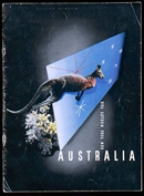
Oldham's role as the designer has subsequently been obscured. While it is tricky attributing authorship on projects by architectural firms whose practice is not to identify individual staff, the situation was compounded by Sydney Ure Smith, who promoted Annand as the pavilion's designer in his publications without any mention of Oldham.[14] Annand's sophisticated use of Bauhaus principles of graphic design is evident on the pavilion brochure (see Fig. 1), yet he had no experience in working with three-dimensional space. However Oldham had come from Perth where he had trained in his father's architectural practice, rendering some of that city's first modernist buildings. Moreover Oldham's design work was informed by a political engagement. As a member of the Communist Party in the early 1930s, he had lectured for the Perth-based Workers Art Guild on the Bauhaus and Moholy Nagy and designed posters for the guild's plays. The pavilion provided both Oldham and Annand with unprecedented resources to experiment with the latest graphic design, audiovisual and photomontage techniques.
Working with an advisory committee consisting of Ure Smith, Harold Souter (representing the government) and Charles Holmes (the head of the Australian National Travel Association), they developed a design. Holmes proved to be a major stumbling block, as Oldham recalled with horror that 'he kept on suggesting inappropriate gimmicks' including 'a great diorama ... with Arthur Streeton's Land of the Golden Fleece plus mounted sheep in the foreground'.[15] They had prolonged negotiations with representatives from agriculture, industry and tourism, most of whom were deeply conservative:
I remember on one occasion Doug [Annand] and I had to fly to Melbourne to convince a group of pastoralists that our scheme for the Agricultural Section met with their approval. Arthur Stephenson ... who was at the meeting was very impressed with the way I presented my report to the group ... He knew but disapproved of my political commitments and presented me with a book Assignment in Utopia which denigrated the socialist experiments going on in Russia ... After reading it I had to tell him I was still a convinced socialist. He was not amused.[16]
Yet Oldham was entrusted with the government project and a budget of more than 40,000 pounds to deliver the interior fit-out. He designed the space as an organic whole to lead 'the spectators around in a planned sequence, starting at agriculture then moving through secondary industry and concluding with tourism which would include sport, the arts, wild life'.[17] The narratives were rendered on the curved walls by photomontages with three additional illuminated wall screens, known as pylons, projecting from the main display.
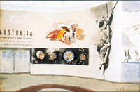
The design was prefabricated at the Royal Agricultural Showground in Sydney, where Oldham developed a colour scheme based on gouache washes over photographs, though these were modified in New York (see Fig. 2).
The walls are a delicate cream, and the floors are of rubber in a strong blue shade with grey traffic direction lines. The flat top and ends of the display counter are in a fairly strong terra-cotta colour. The sloping bases of the show-cases are grey, the fronts cream, to match the walls, and the legs of the pylons a light yellow.[18]
The inspiration of Aalto's sanatorium was visually extended on the walls through imagery of a healthy modern nation peopled by lithe athletic bodies of bathers, surfers and sportsmen. The visitor followed the pathway around the photomontages to a mezzanine placed at 'the narrow section of the fan-shaped area ... elevated to [make a] stage-like, lounge space which was semi-enclosed by a series of box-like compartments, the top of which formed a continuous flat surface over which people sitting on the lounge area could obtain at their leisure a panoramic view'.[19]
In that lounge space the most arresting panoramas were provided by a novel invention called an 'Illuvision' viewed through a large TV-shaped window in the wall. While the fair was celebrated for launching early black-and-white television to a mass market, the 'Illuvision' was popular because its mechanised dioramas offered a continuously changing sequence of full colour, three-dimensional landscapes. Each view in the 'Illuvision' was visible for a minute before fading into another by means of a revolving cylinder, using lights and mirrors. The eight dioramas were all landscapes, including water views of Sydney and Melbourne. An industrial scene and a historic pageant had been rejected. These were meticulously constructed in New York by two Russian artists. This had presented some challenges, as the architect Tom O'Mahony who supervised work on the pavilion for Stephenson and Turner in New York explained:
We had these fellows studying every available photograph, colour print and even going to the Library to look up Hans Heysen, etc., and for two fellows reproducing something, the like of which they have never seen before, they are doing a swell job. Imagine explaining to them the colour of the trunk of a blue gum, and how the bark peels off and scatters about below, or what ti-tree on a beach looks like, how surfing is done, what the haze looks like in the Blue Mountains, etc.[20]
Tiny figures of tourists were placed within the dioramas which, unlike most of the other miniature worlds on display at the fair, were not futuristic, but offered exotic views of the remote continent. The 'Illuvision' screen was framed on the wall by Annand's motifs of Aborigines hunting and fishing, borrowed from Aboriginal rock art to evoke an exotic 'primitive' idyll. On the other side of the lounge area hung six large canvases of Australian wildflowers by Margaret Preston, partly inspired by murals she had recently seen on a tour of Mexico and North America.[21] Yet the scale did not suit her and it was only their ingenious installation in a continuous strip frame, stretching six metres along one side of the mezzanine, that redeemed their repetitive composition for a contemporary reading, producing a serial effect, like film stills. While the committee had considered abandoning the 'Illuvision' as costs soared to more than ten times the price of Preston's six paintings, it proved to be a major drawcard and was judged the most popular exhibit in the pavilion.
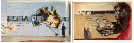
European avant-garde exhibition design based on photography, rather than painted murals, was the major visual reference for the designers. In the late 1920s the Bauhaus had experimented with photomontage in displays, using dramatic close-up and aerial views of the modern world and the modern worker. Meanwhile Oldham, who at the time was working with political photomontage, appears to have been particularly interested in the exhibitions designed by El Lissitzky. Lissitzky's design for the 'Pressa' exhibition of 1928 in Cologne was the subject of a major article in Commercial Art, an authoritative British journal, which recommended it as 'full of inspiration for the businessman'.[22] The Soviet display gave photography an architectural role as agitprop, creating large-scale socialist photo-narratives: 'the room thus became a sort of stage on which the visitor himself seemed to be one of the players'.[23] The Australian pavilion was modelled on a similar theatrical space, with the viewer following national narratives of industry, sport and tourism like film stills (see Fig. 3). The photomontages projected Australia as a prosperous and egalitarian society on a vast continent, living in peaceful coexistence with the Indigenous hunters and gatherers. At the time Oldham was juggling very different kinds of work, designing anti-fascist photomontages and cartoons for the local Communist Review while working on the pavilion with Sydney's leading commercial artists and photographers. He adapted techniques from Soviet Realist photography, directing Roberts to shoot a monumental head of a worker for the 'Industry' graphic to indicate the favourable labour conditions for American investment in Australia (see Fig. 4). Such a strategy was consistent with the policy of the Communist Party of Australia at the time who supported stronger ties with the United States, arguing that US trade pacts with Britain would strengthen international peace and democracy.
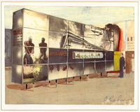
Oldham later recalled that 'Douglas Annand was the most imaginative in handling the graphic details of the display where original drawing and painting was needed and Russell Roberts' excellent understanding of the techniques of photography permitted us to obtain bold contrasts in the scale of our pictorial images and an exciting montage'.[24] The young modernist photographer Max Dupain was commissioned to take an aerial view of Sydney Harbour, looking across the new bridge, which was printed up as a major horizontal mural and hung high, as if the viewer were arriving by air. New Yorkers may have favourably compared their own silvery arch between Staten Island and New Jersey, commissioned later yet completed by 1931 at a length competitively extended beyond that of the Sydney Harbour Bridge. The Sydney artist Adrian Feint, who painted circular motifs of tropical fish and a scene of Papua New Guinea on glass panels, introduced Annand to mural painting. Roberts, who ran the largest advertising studio in Sydney at that time, had patented a commercial display technique for back illuminating hand-coloured prints called 'Russellites', which in the pavilion became the sides of wall-sized glass light boxes, known as pylons, raised off the floor on thin metal legs. In the 'Travel' section 'Russellites' juxtaposed muscular Aboriginal men hauling in a giant turtle with the equally dazzling blue and gold streamlined body of the new Stephenson and Turner-designed train, the Spirit of Progress (see Fig. 5). Other novelties included a rotating silver globe and a moving belt of coloured 'Russellite' photographs that ran through a large relief map of the continent made up of different native timbers. O'Mahony noted that:
our room certainly looks 'something' besides the Colonial Hall next door, which is a collection of poor still dioramas and literally thousands of coats of arms ... the work on our walls is a relief after the crude and commercial stuff seen in most of the American pavilions. To the Americans a world fair is simply an extension of their sales room, with a lot of ballyhoo.[25]
The influential English journal, the Architectural Review, was inclined to agree, dismissing their own pavilion as uninspiring, while recognising how 'Australia has given her own modern designers a chance. The mural display throughout is extremely effective'.[26]
Penfold had inspected the pavilion when it was under construction at the showground in Sydney in late 1938, and subsequently ordered a display of large format 'Russellites' for the entrance of the Technological Museum as part of the wool display, then one of its most significant holdings. On his return to Australia, Penfold was enthusiastic about introducing fluorescent lighting into a model showcase 'to show visitors the adaptation of modern display methods for museum purposes and to enable them to visualise how much more attractive exhibits will be in the windowless museum of the near future'.[27] Yet his ambitions for a Modern Museum of Applied Science, Art and Industry for Sydney were stymied by the onset of war.
Oldham's political commitments had kept him in Sydney during the installation, but with some assistance from Stephenson and Turner he and his wife Ray arrived in New York in June 1939 for three months, spending much time at the fair.
We enjoyed the Swedish pavilion the best from the design point of view with its light graceful structure and the clear simple display methods ... and the Finnish pavilion designed by (Aino and) Alvar Aalto but felt it was rather overcrowded and the form tended to press down on the observer rather unhappily (though) the timber detailing was excellent. Le Corbusier was represented by a number of his students and proselytises working in South America ... not anything like as pleasing as the Swedish pavilion ... Altogether I found the whole of the Fair very stimulating and inspiring in terms of contemporary design ... and it has been a constant inspiration and influence on my creative work ever since.[28]
The irony of Menzies (whose first short term as prime minister coincided with the fair) launching such a modernist design would not have been lost on Oldham. Listening in New York to 'Pig Iron Bob', he knew of his public stoush with local modernists over the Australian Academy of Art. In fact Menzies would no doubt have admired Preston's wildflowers but would have been horrified by the Soviet-style montage. Douglas Annand never visited New York. However, from the Architectural Review he sketched various architectural murals and pavilions, including the Aaltos' Finnish exhibit and the murals schemes on Sven Markelius's Swedish pavilion. Annand predicted that 'these exhibitions have done much to win over architects and the public to the use of murals and the tendency to consult artists more on questions of interior design ... It is developing a taste for sound design and decoration which will be reflected in public taste'.[29] He went on to execute numerous murals and other architectural commissions, as part of the second wave of Australian modernism which played a significant part in reshaping public space through the 1950s and 1960s. Meanwhile Oldham undertook further exhibition designs before making a significant contribution to landscape architecture in Western Australia. Their early partnership on the pavilion had created a functional modern space that was neither elitist nor derivative. Significantly, its cross-media character was akin to the early design-focused avant-garde movements such as Constructivism and the Bauhaus, which had been its inspiration. Yet it would be another three decades before any Australian museum embraced modernism in architecture, art or design, despite an increasing public presence on the street.
This paper has been independently peer-reviewed.
1 Prime Minister Robert Gordon Menzies' address, 'Australia's Salute,' was broadcast at the Australian Broadcasting Commission on 11 August 1939, the day designated 'Australia Day' by the fair authorities; transcribed by the author. Cover title no. 192017, National Film and Sound Archive.
2 AR Penfold, diary, January - October 1939, no pagination. Powerhouse Museum archive, MRS 307-17/4. Penfold was funded by the Carnegie Corporation of New York, in order 'to obtain all the information possible about the planning, construction, management, etc., of modern science museums, as well as the best methods of displaying exhibits in such museums'. Annual Report, Technological Museum, Department of Public Instruction, Technical Education Branch, New South Wales, 31 December 1939, p. 1.
3 ibid.
4 AR Penfold, Annual Report, Technological Museum, Department of Public Instruction, Technical Education Branch, New South Wales, March 1943, p. 4. MoMA's motion picture program made such an impression on him that Penfold persuaded the New South Wales state government to open a theatrette for technical films in the Sydney Technological Museum three years later, in the midst of the Second World War.
5 AR Penfold, diary, July 1939, no pagination.
6 'The Australian Pavilion at the Paris Exhibition', Art in Australia, 15 May 1937, pp. 26-34. Though no author is identified it was presumably written by Sydney Ure Smith.
7 Gordon Andrews, A Designer's Life, New South Wales University Press, Sydney, 1993, p. 26.
8 ibid. The political dimension of the Paris Exposition is examined in Dawn Ades et al. (eds), Art and Power: Europe under the Dictators 1930-45, Thames & Hudson, 1996.
9 EL Doctorow, World's Fair, Picador, London, 1985, p. 184, p. 239.
10 Philip Goad, 'Pavilions and national identity; Finland and Australia at the 1939 New York World's Fair', in Loyalty and Disloyalty in the Architecture of the British Empire and the Commonwealth, Selected papers from the Thirteenth Annual Conference of the Society of Architectural Historians, Australia and New Zealand, Melbourne, 1996, pp. 34-35.
11 ibid., p. 37. These arguments are further developed in Philip Goad, 'Collusions of modernity: Australian pavilions in New York and Wellington, 1939', Fabrications, vol. 10, August 1999, Melbourne, pp. 22-45.
12 Philip Goad, 'The business of Modernism', Australian Modern: The Architecture of Stephenson & Turner, State Library of Victoria, 2004.
13 John Oldham, 'Autobiography', unpublished manuscript, no pagination. I am grateful for the access to his work given by his daughter Tish Philips, who interviewed her father in 1981. Her work formed the basis of Julian Goddard's essay, 'John Oldham', Aspects of Perth Modernism 1929-1942, Centre for Fine Arts, University of Western Australia, 1986, pp. 38-41. All further Oldham citations are from the autobiography.
14 The lack of acknowledgement of Oldham's design in Sydney Ure Smith's various publications is repeated in the recent catalogue by Anne McDonald, Douglas Annand: The Art of Life, National Gallery of Australia, Canberra, 2001.
15 New York World's Fair papers, May 1938, Item No. 666/1/53, National Archives, Canberra.
16 John Oldham, 'Autobiography'.
17 ibid.
18 Tom O'Mahony to Arthur Stephenson, 17 March 1939. Stephenson and Turner archive, vol. 230, State Library of Victoria.
19 ibid.
20 ibid.
21 Margaret Preston, 'American art under the new deal: Murals', Art in Australia, November 1937, pp. 51-58.
22 Jan Tschishold, 'Display that has dynamic force: Exhibition rooms designed by El Lissitzky', Commercial Art, vol. X, London, 1931, p. 22.
23 ibid., p. 26.
24 John Oldham, 'Autobiography'.
25 Tom O'Mahony supervised the production of the globe and 'Illuvision' in New York and sent a detailed assessment of the pavilion. 2 June 1939, item no. 666/1/33, National Archives of Australia, Canberra.
26 'The New York World Fair: Special issue', The Architectural Review: A Magazine of Architecture and Decoration, vol. LXXXVI, no. 513, August 1939, pp. 74-76.
27 AR Penfold, Annual Report, Technological Museum, Department of Public Instruction, New South Wales, December 1939, p. 3; AR Penfold, 'Requirements of a modern museum of applied science, art and industry for Sydney', Architecture, August, 1940.
28 John Oldham, 'Autobiography'.
29 Douglas Annand, 'Australia at the World's Fair', Art in Australia, series 3, no. 74, February 1939, p. 59.